Political Campaigns
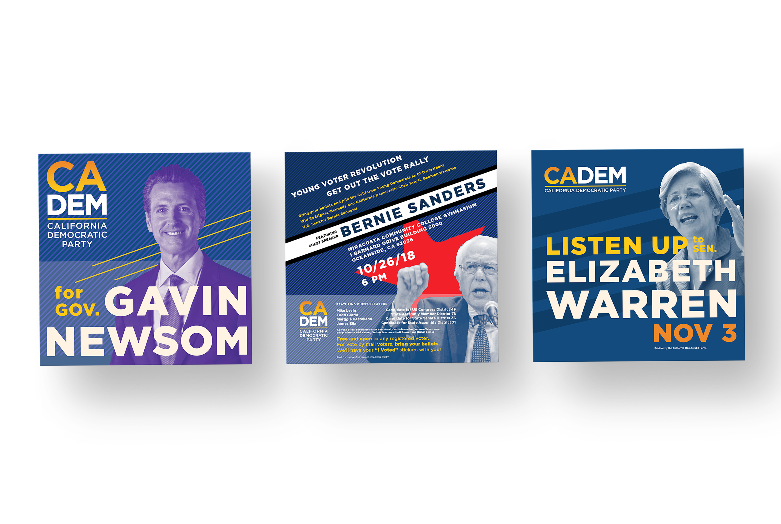
Political design carries real weight, every color, headline, and layout choice shapes how millions of people perceive a candidate before a single policy is read. That's the challenge I took on with this collection, marketing materials created for high profile Democratic campaigns between 2018 and 2020, including work for Gavin Newsom, Elizabeth Warren, and Bernie Sanders. Every piece was built with intention, using visual hierarchy, strategic imagery, and carefully crafted typography to guide attention and evoke genuine emotional response, not just capture it.
Across every campaign, I leaned into a bold, progressive design language, dynamic layouts, confident color, modern typographic choices, built to reflect the forward thinking values these candidates stood for. The goal was never decoration, it was reinforcement, making sure every visual touchpoint echoed the same conviction and momentum defining each campaign's public persona. Design doesn't just support a message in political work, it becomes part of the message itself, and that's exactly the standard I held every piece in this collection to.
CADEM social media
Governor Gavin Newsom 2018 re-election endorsement campaign
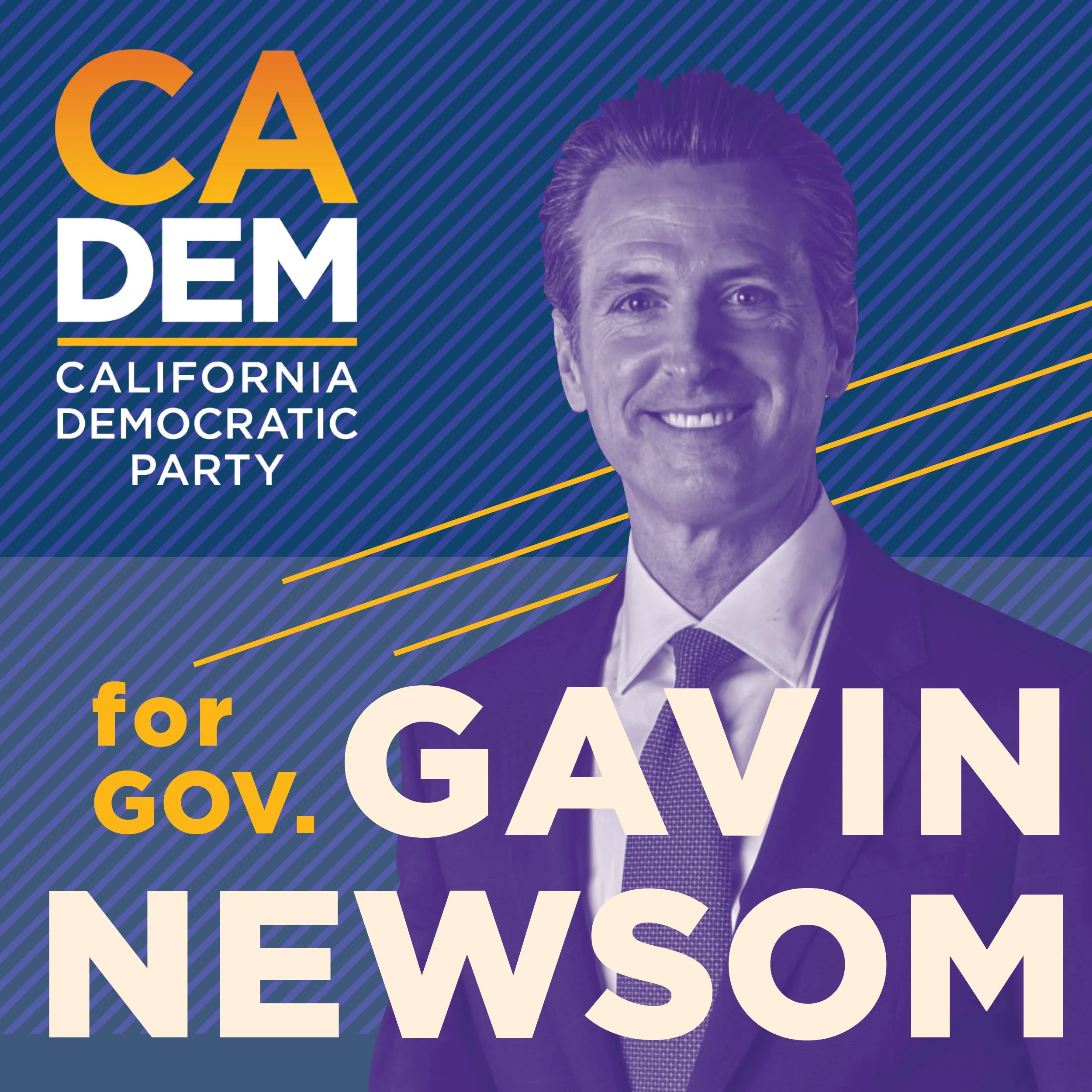
Political messaging doesn't have to choose between persuasion and beauty, at its best, it does both. That's the idea behind this social media campaign, created for Governor Gavin Newsom's 2018 re-election bid under the California Democratic Party. I approached this work not just as marketing, but as art with a purpose, proof that the same creative tools shaping galleries and design studios can just as powerfully shape public opinion and social change.
Every visual choice was made to elevate the campaign beyond typical political messaging, treating aesthetics as a legitimate, essential tool for connection rather than an afterthought layered on top of strategy. This piece represents what I believe design can do at its most powerful: turn conviction into something people don't just read, but genuinely feel.
CADEM social media
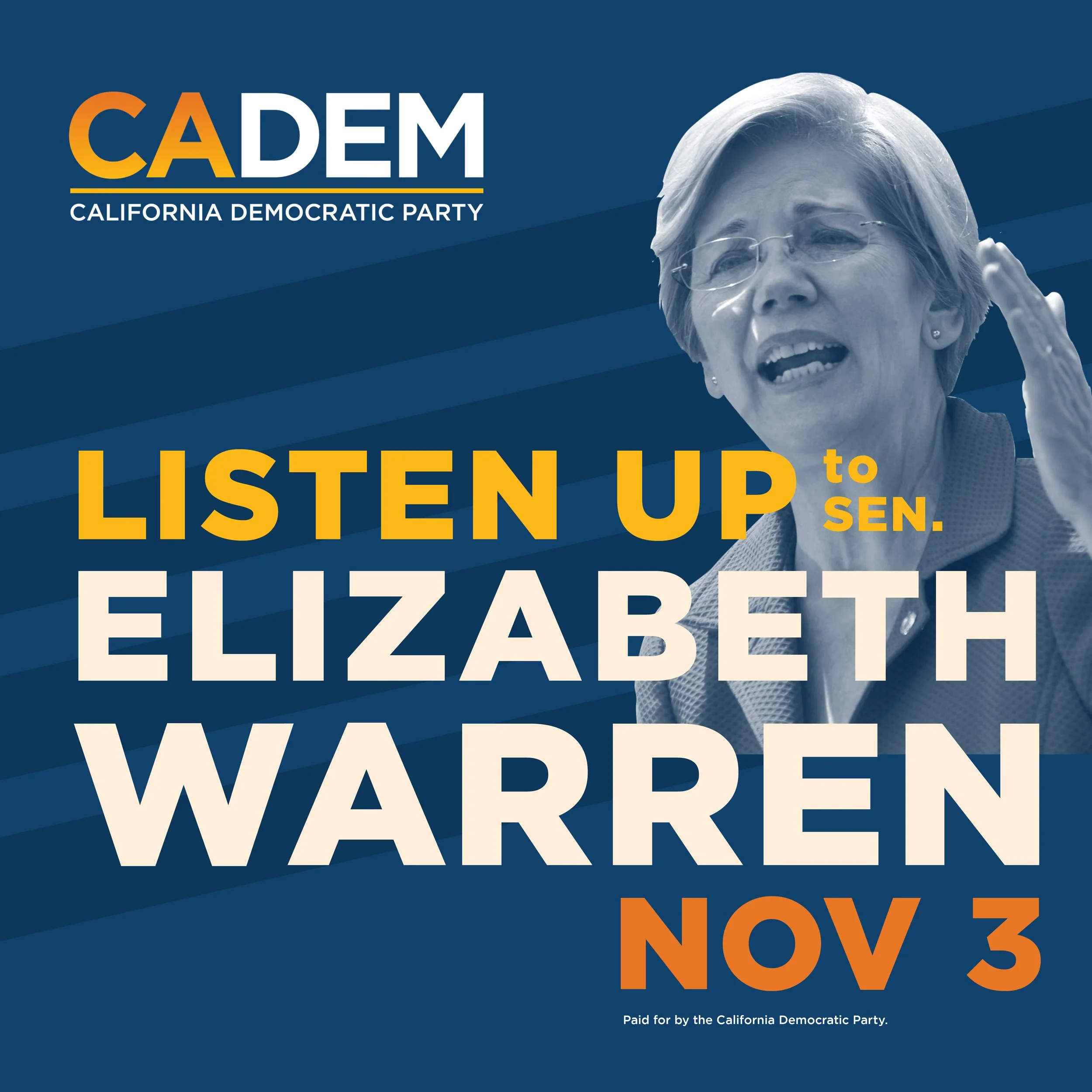
“Listen up” with senator elizabeth warren
Reaching young voters takes more than information, it takes energy, urgency, and a visual language that feels genuinely theirs. That was the challenge behind this campaign, designed to promote a speaking rally for Senator Elizabeth Warren focused on motivating younger voters into the political process. I built the piece to be loud in the best way, bold color, confident type, and visuals crafted to capture the pulse of empowerment and civic activism at the heart of Senator Warren's message.
The goal wasn't just to announce an event, it was to make young voters feel like they were being spoken to directly, not lectured at. Every design choice worked to translate a message of activism into something visually magnetic, proof that political engagement can be exciting, urgent, and genuinely worth showing up for.
CADEM social media
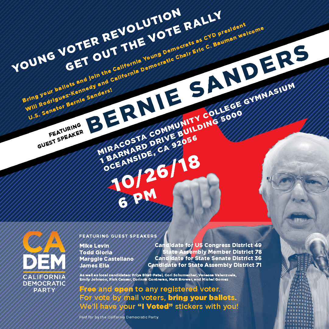
“Young Voter Revolution: Get the Vote Out Rally” with Senator Bernie Sanders
Some campaigns inform, others ignite, and this one was built to do the latter. Designed to promote a speaking rally for Senator Bernie Sanders, this piece was created to inspire the next generation of voters to step off the sidelines and into the political process. Every visual choice was intentional, energy, optimism, and urgency woven into every layout, color, and line of type, because a call to action only works if people actually feel called.
This is design as momentum, not decoration. The goal was never just to announce an event, it was to make viewers feel like their voice genuinely mattered, and that showing up was the whole point. That's the kind of work I want to keep making: creative that doesn't just capture attention, but moves people to act.
CADEM social media
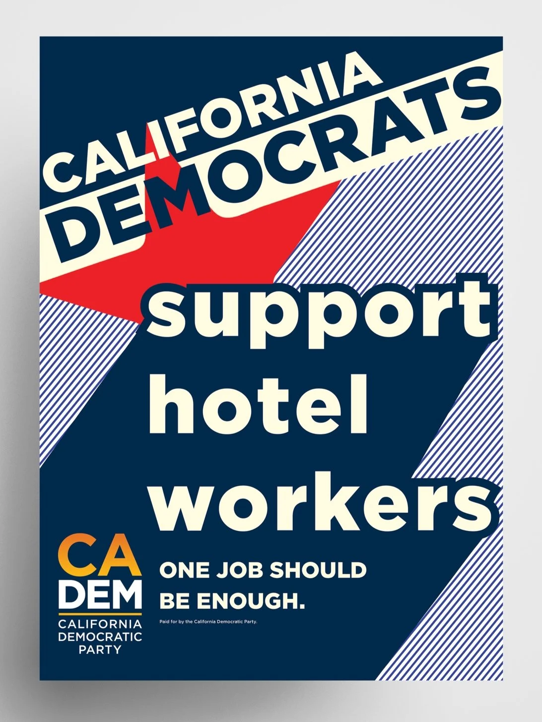
Support Hotel Workers: CA Democratic Party
Some causes don't need convincing, they need volume, and that's exactly what this poster was built to deliver. Designed for the California Democratic Party in 2018, this piece stood behind hotel workers fighting for a simple, undeniable truth: one job should be enough. I built the design around kinetic typography and a glimmer of Russian Constructivism, creating a bold, cohesive look grounded in a striking navy and red color palette, letting the message hit with the same urgency and conviction the workers themselves brought to the picket line.
This wasn't a poster meant to blend into a rally, it was meant to be seen from across a room and felt in one glance. Every element, the angled star, the punchy diagonal banner, the stacked typographic hierarchy, was designed to command attention and turn a labor demand into a rallying cry impossible to ignore.
cadem social media
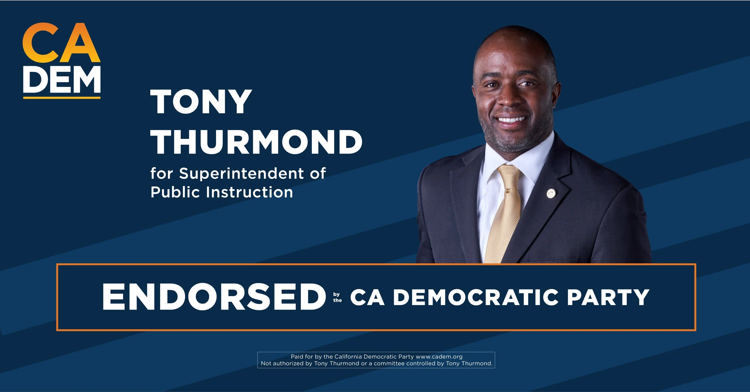
tony thurmond 2018 endorsement campaign
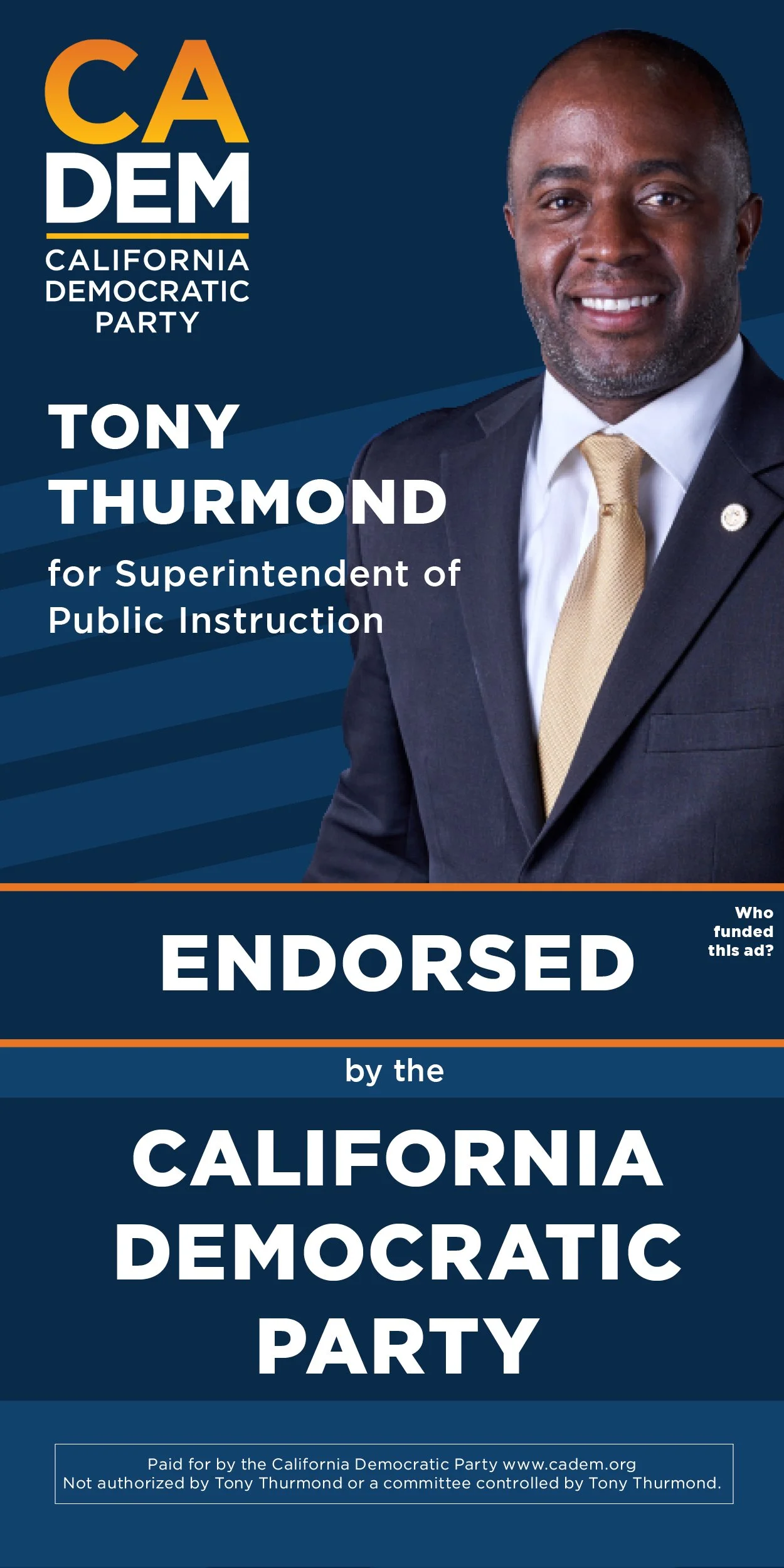
Education policy rarely gets the visual urgency it deserves, but this collection of ads for Tony Thurmond's 2018 campaign for California Superintendent of Public Instruction was built to change that. As a challenger running to replace a term limited incumbent, Thurmond needed visuals that could cut through a crowded field and make his vision for California's six million students feel immediate and real, not just another down ballot race easy to overlook. I designed the collection to carry that urgency, bold typography, confident color, and messaging built to connect Thurmond's commitment to public education directly with the voters who'd feel its impact most.
Every choice in this collection was made with one goal: making an often overlooked race impossible to ignore. Down ballot campaigns rarely get the design attention top of ticket races do, but I believe every election deserves visuals strong enough to earn real public attention, and that's exactly the standard I held this collection to.
Left Hook Strategy
“Goodbye gaspar” social media campaign
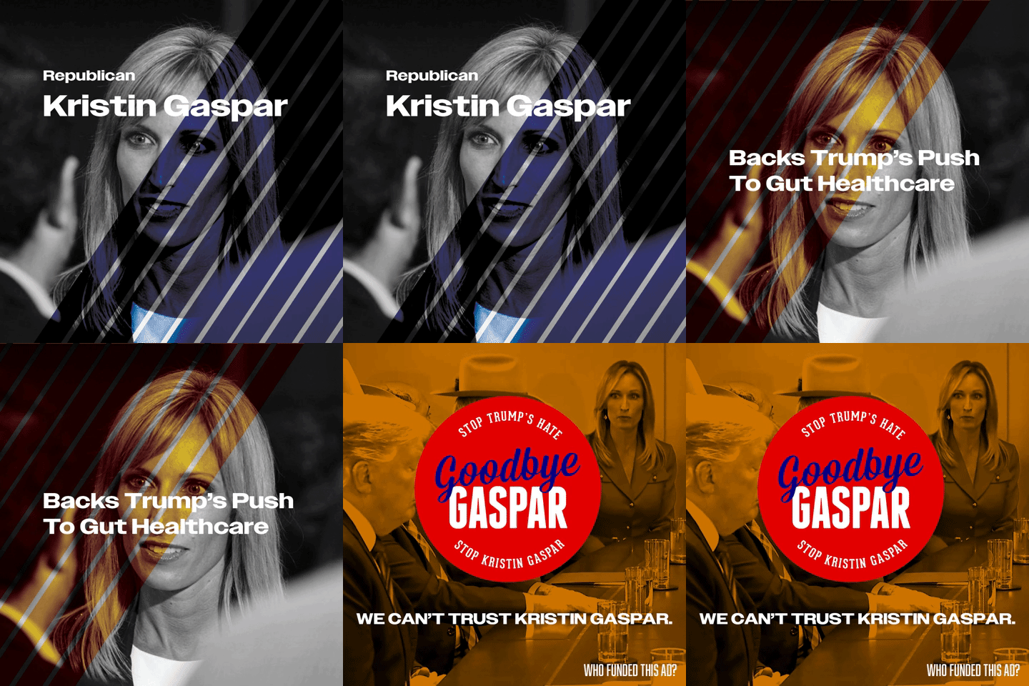
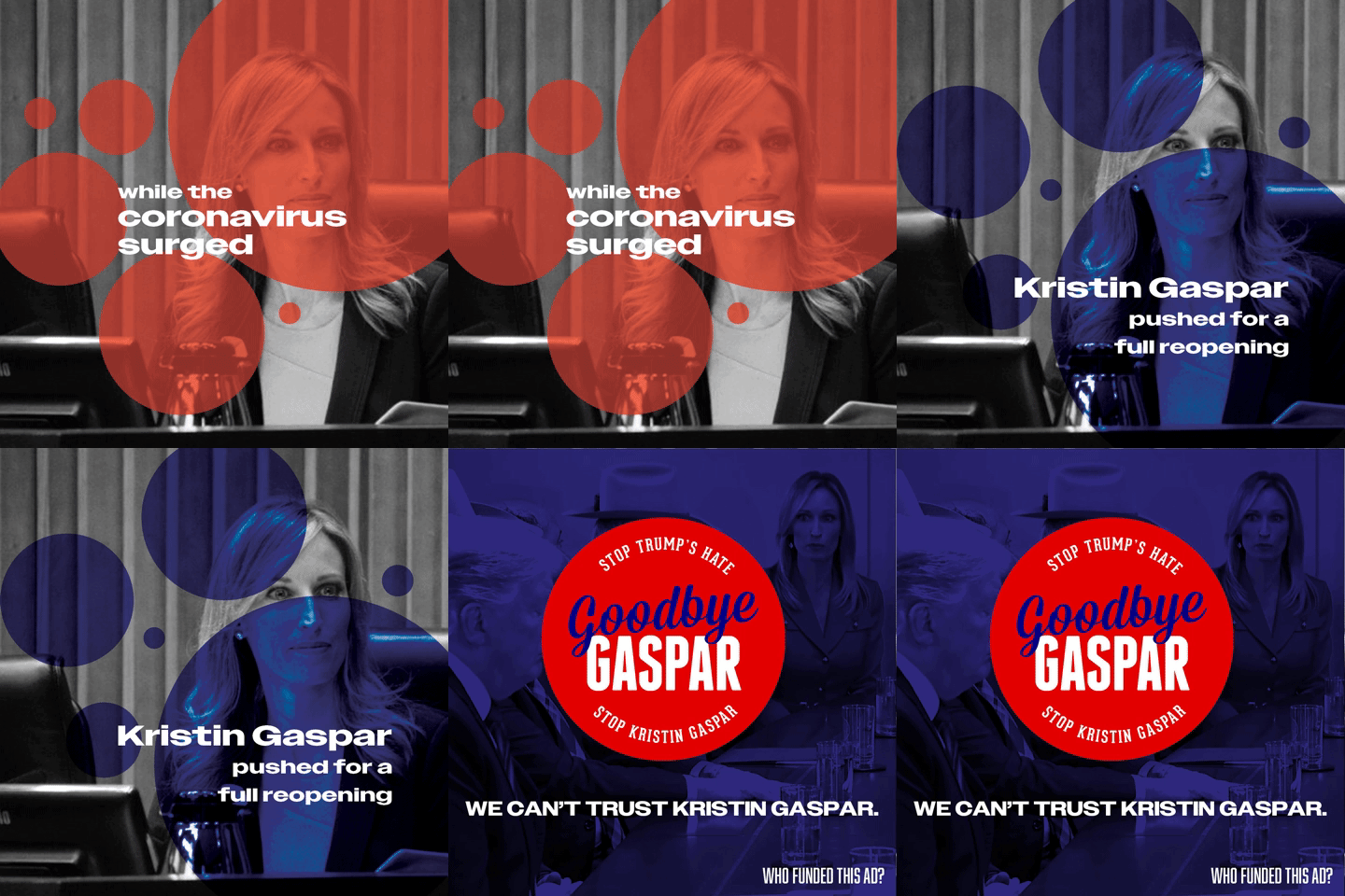
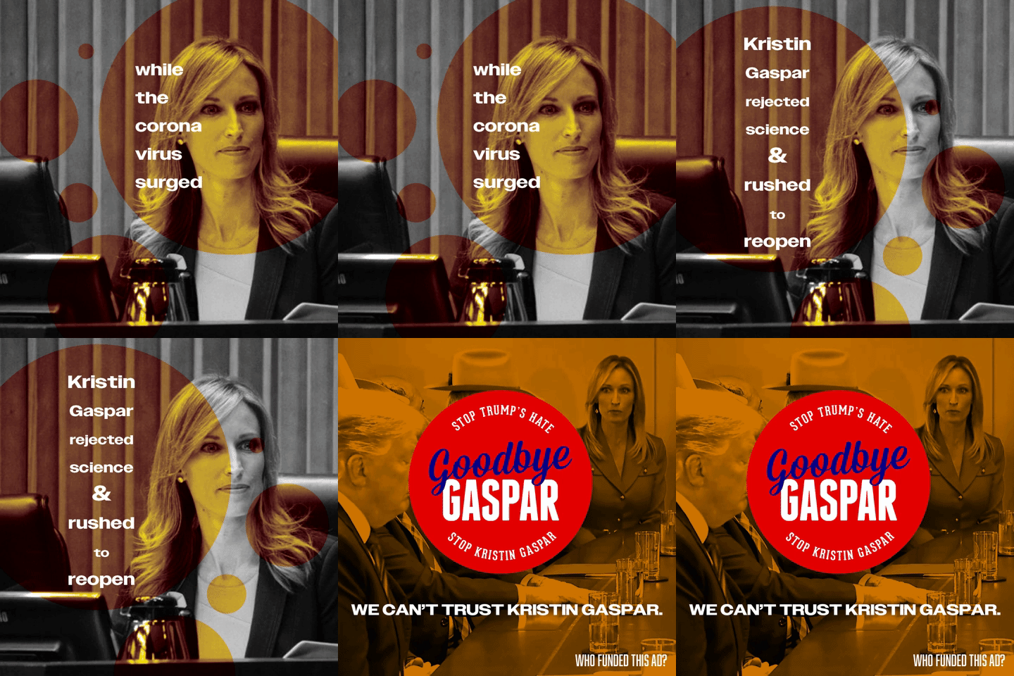
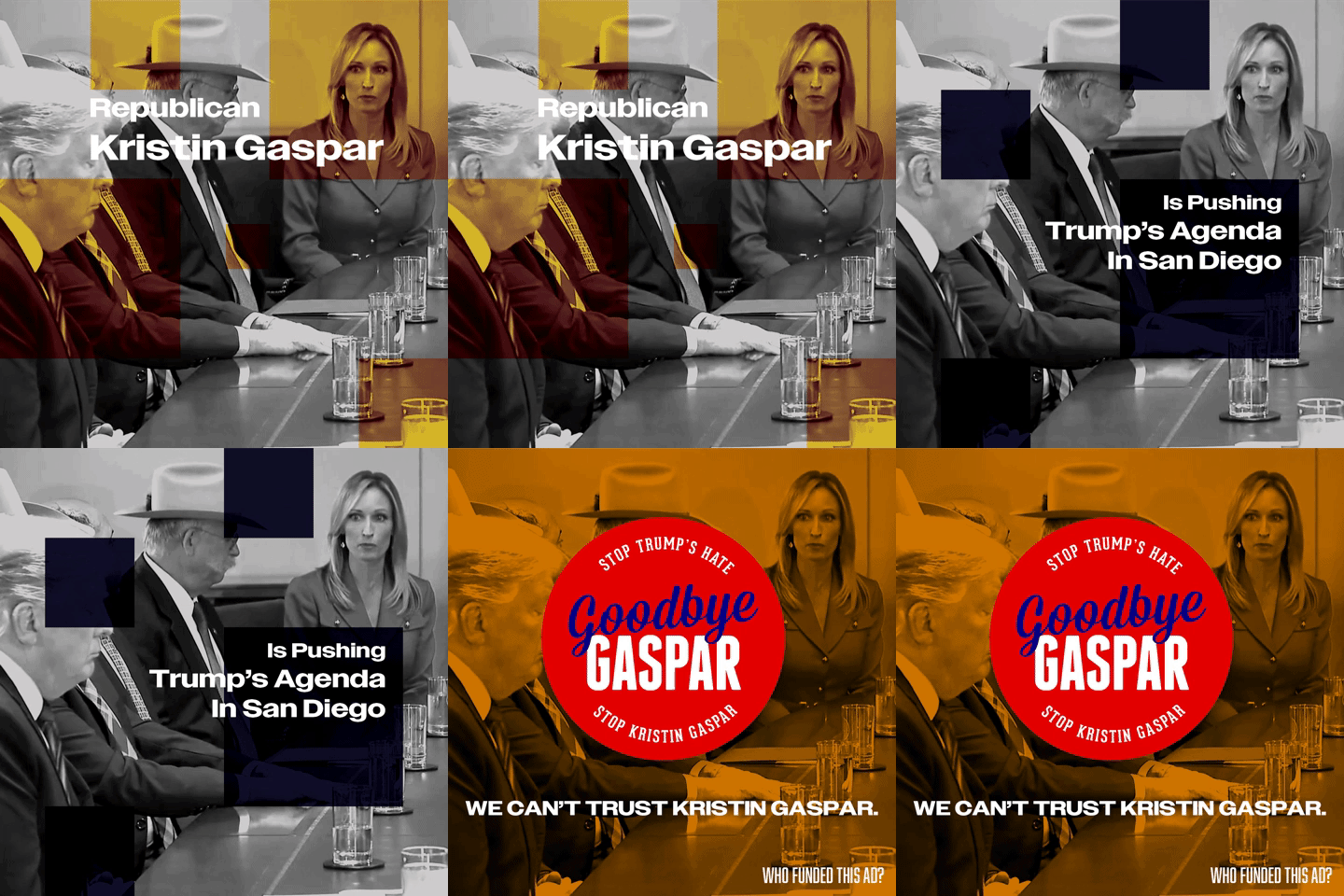
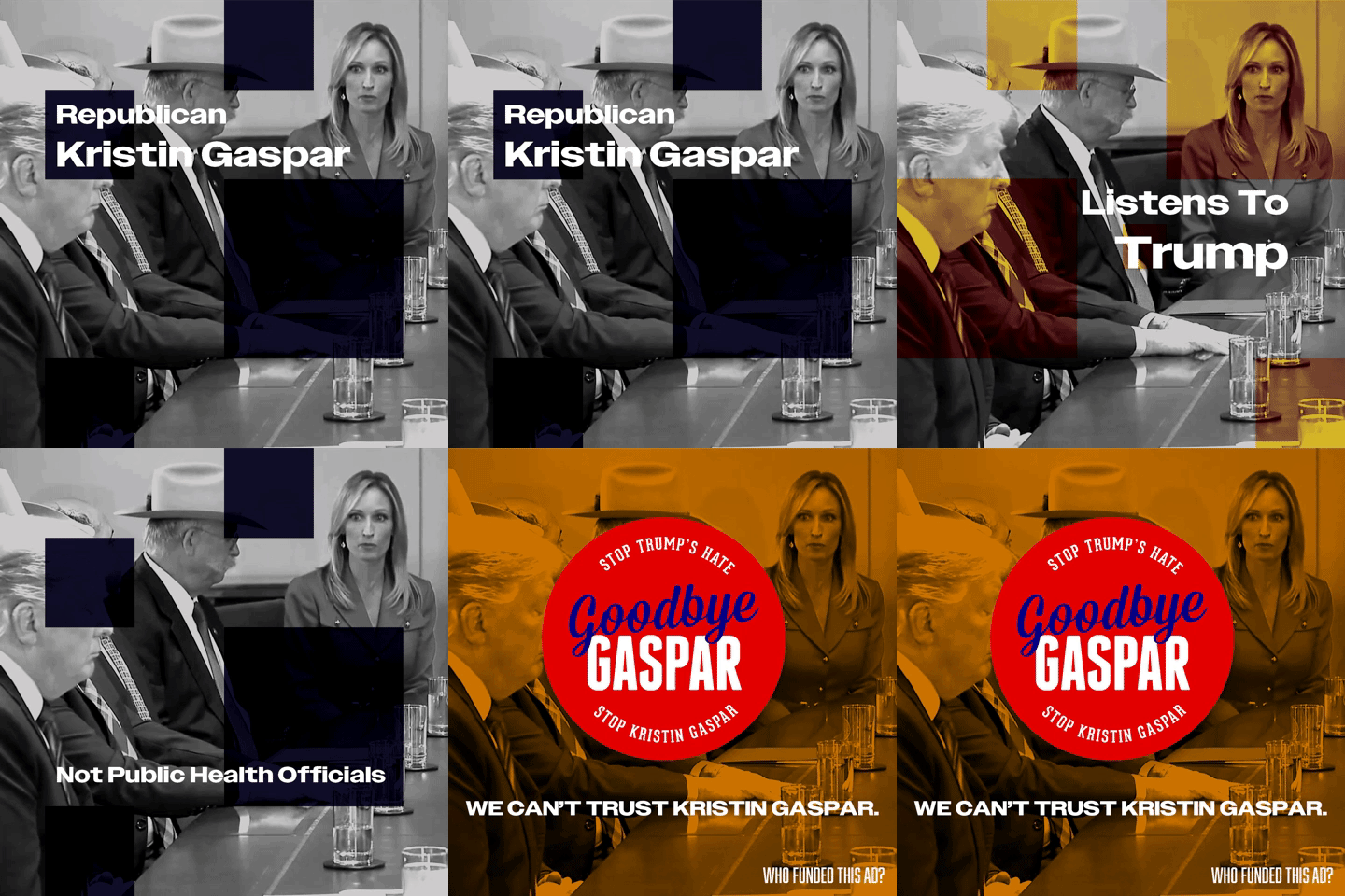
Some design work exists to inform, this piece existed to warn. Created during incumbent Kristin Gaspar's 2020 re-election bid, this campaign was built to expose her political record and its real consequences for the COVID-19 response and the broader healthcare landscape, particularly her efforts to repeal the Affordable Care Act and her close alignment with the Trump administration. I used evocative imagery and sharp, persuasive messaging to make the stakes impossible to ignore, because voters deserved to understand exactly what was on the line.
This is design in service of accountability, using visual storytelling to spark real public discourse and push people toward informed action at the ballot box. Gaspar did not win her 2020 re-election bid, a result this campaign was built to help drive.
Left Hook Strategy
rafael castellanos 2018 endorsement campaign
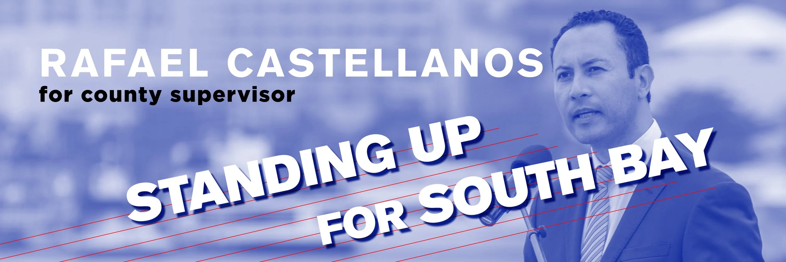
Local elections often get lost in the noise of bigger races, but this campaign was built to make sure Rafael Castellanos' bid for County Supervisor cut through anyway. Designed for use across Twitter, Facebook, and Google Ads, this piece needed to work fast and hard, capturing attention, establishing credibility, and delivering a message in the span of a scroll. I built the design around a bold, angled typographic treatment for "Standing Up for South Bay," giving the headline real physical momentum, while a striking blue duotone photo of Castellanos mid-speech reinforced authenticity and leadership without feeling overly staged.
Every choice here was strategic. The dynamic diagonal lines and confident type create visual energy that mirrors the campaign's message of action and advocacy, while the clean hierarchy, name, title, message, ensures the ad reads clearly even at a glance, critical for a digital ad competing against dozens of other messages in someone's feed. This wasn't just about making Castellanos recognizable, it was about making him feel like the obvious choice, someone actively fighting for the region he wanted to represent.
Across three very different platforms, this single cohesive design language had to flex and perform, and that's exactly what good campaign creative is built to do: stay consistent, stay bold, and stay impossible to scroll past.