Posters
Color isn't decoration, it's language, and this poster series was built to speak it fluently. Through a careful balance of form, typography, and color, I set out to explore color as pure expression, embracing bold, experimental applications that pushed past conventional design practice and uncovered new instincts about my own creative process along the way.
Posters remain one of design's most powerful tools precisely because they have to do everything at once, combine text and image into something memorable, emotionally resonant, and genuinely impactful, all within a single glance. This collection leaned fully into that challenge, using visibility and adaptability to promote ideas, shift perception, and leave a mark that lingers past the first look. More than anything, this body of work is proof of what design can do at its most expressive, showing just how far visual storytelling can stretch when color is allowed to lead.
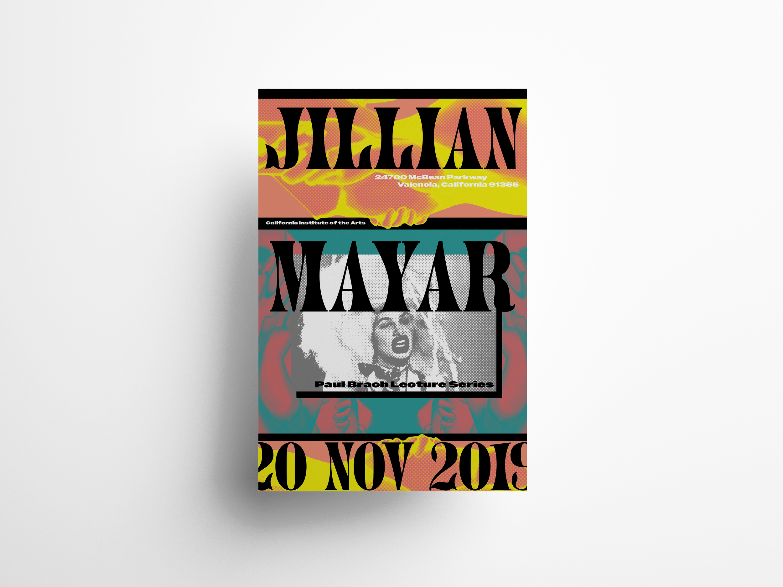
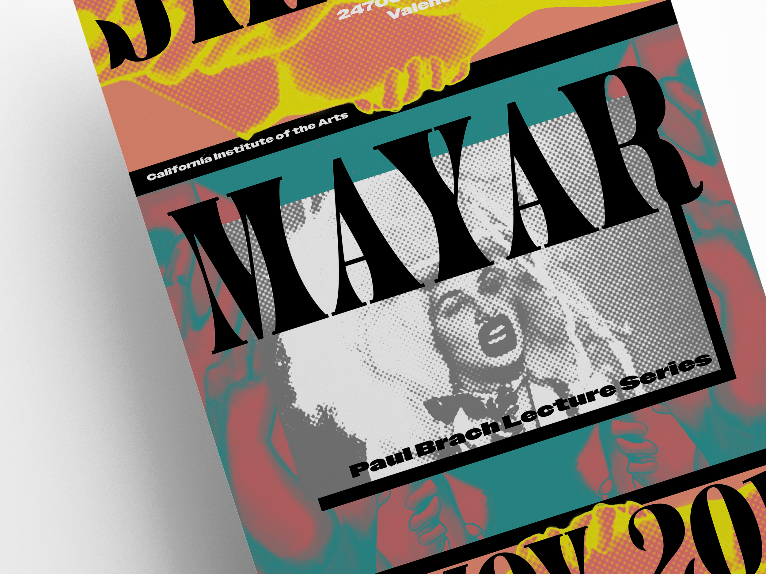
Jillian Mayar: Visiting Artist Lecture Series
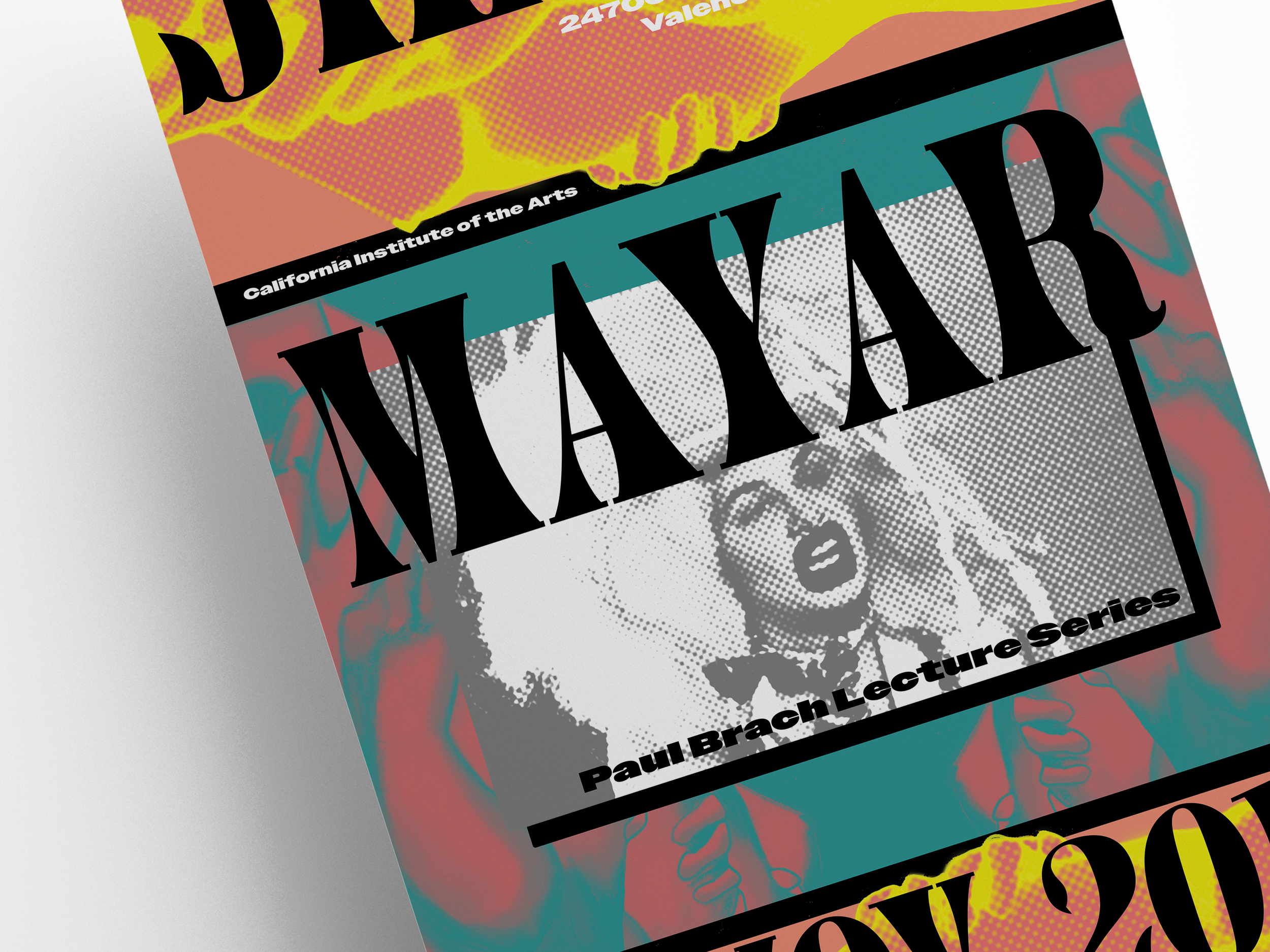
Designed for visiting artist lecturer Jillian Mayar, this poster served as a way to explore the explosive methodologies of Paula Scher while confronting the same themes Mayar herself grapples with. I wanted the piece to work first as a formal exploration, then reveal itself as a kind of lightbox of layers, echoing Mayar's fascination with the tension between our online and physical worlds and the increasingly porous boundary between the two.
To capture that confrontation with technology, I used vibrating colors to create a sense of movement, contrasting textures to add real depth, and paradoxical typography to evoke tension throughout the composition. Layered together, these elements leave the viewer gulping for air, overwhelmed by the formal restlessness of the piece itself. In the end, this project became something more personal than a typical assignment, a genuine, emotional exploration of where art and design collide, and a chance to push what visual communication can actually do.
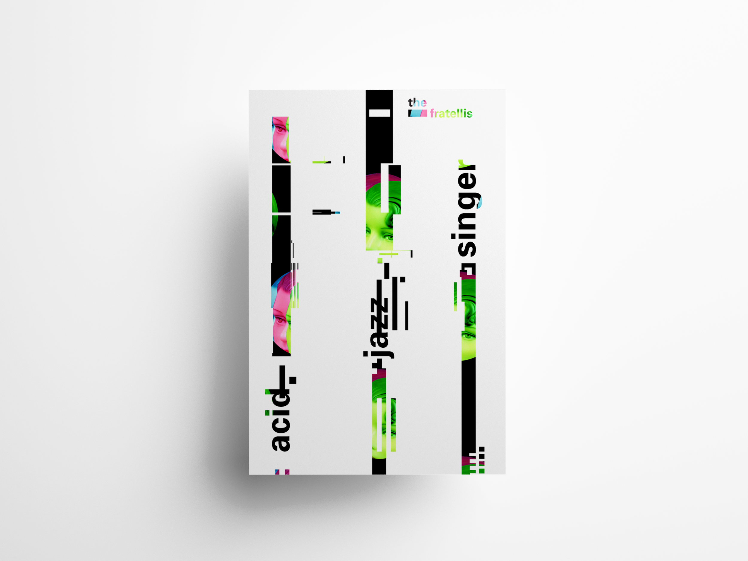
Acid Jazz Singer: The Fratellis
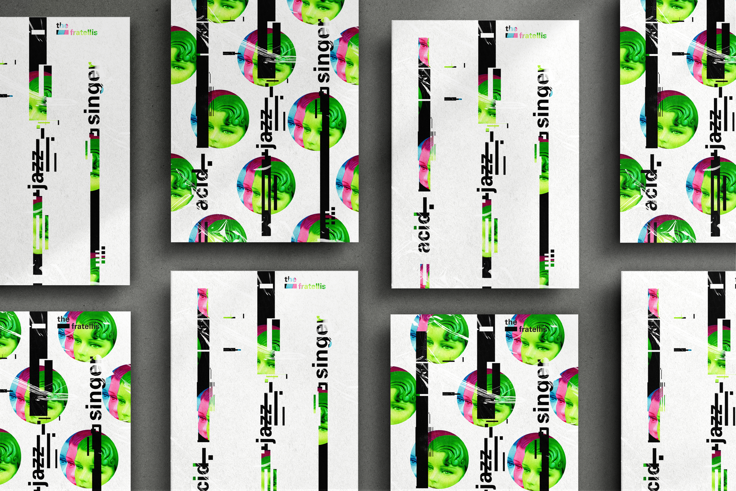
Acid jazz is a genre built on collision, old sounds warped into something entirely new, and this poster series set out to capture that same energy visually through distorted, layered photography. The first poster in the series pays tribute to the genre's early movement, a moment defined by electronic dance beats and percussion fused onto jazz recordings from the 1960s and 1970s. I represented that fusion through circular shapes, echoing the percussive pulse that gave the genre its new, unexpected rhythm.
The second poster shifts focus to the genre's later evolution, a period shaped by those earlier recordings and driven by groove as its central force. Here, linear sections emulate sheet music distorted almost past recognition, electrified by vivid blue, magenta, and green, as if the sheer energy of the sound had physically burst through the page. Together, the two pieces trace acid jazz's evolution not through explanation, but through visual sensation, letting color, form, and distortion do what the music itself was always doing, breaking tradition apart and building something electric in its place.
CADEM: one job should be enough
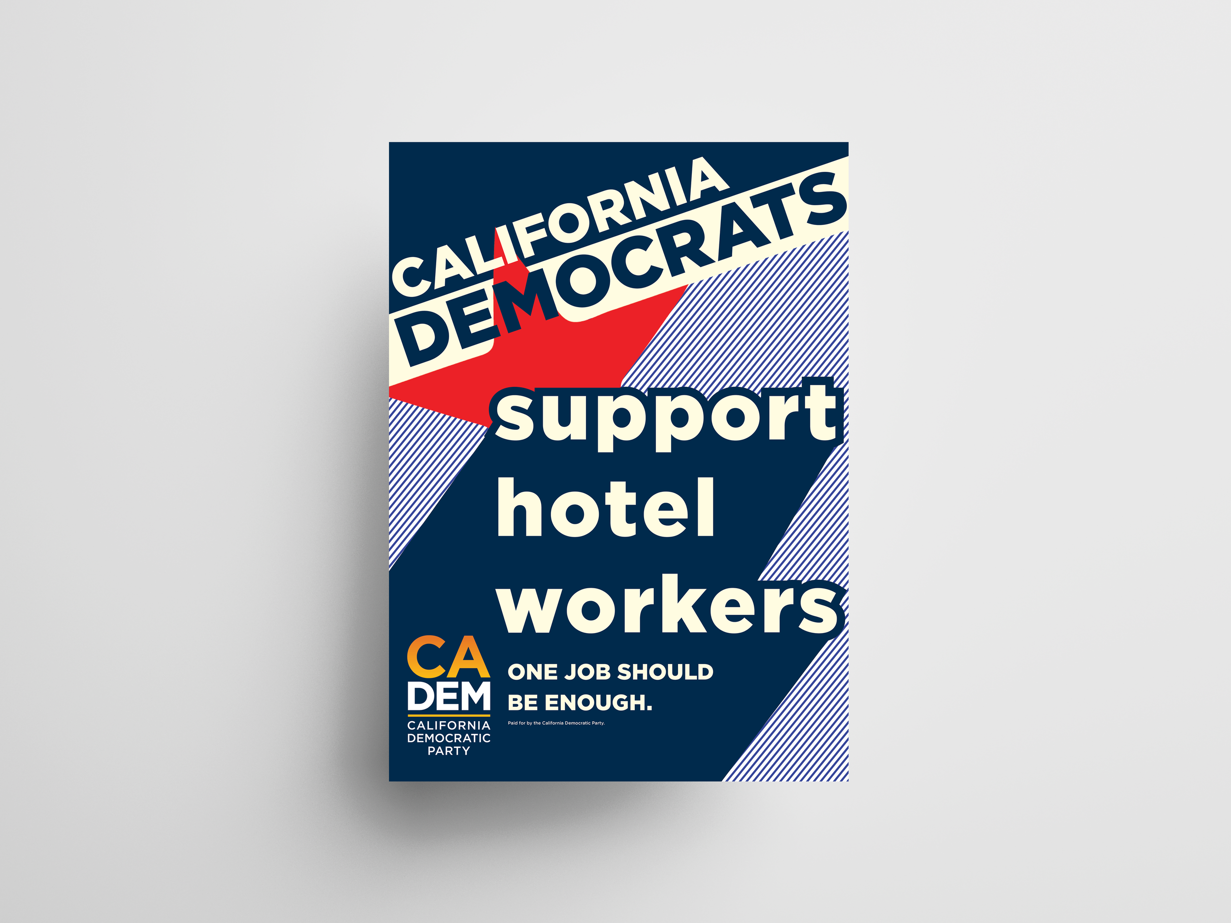
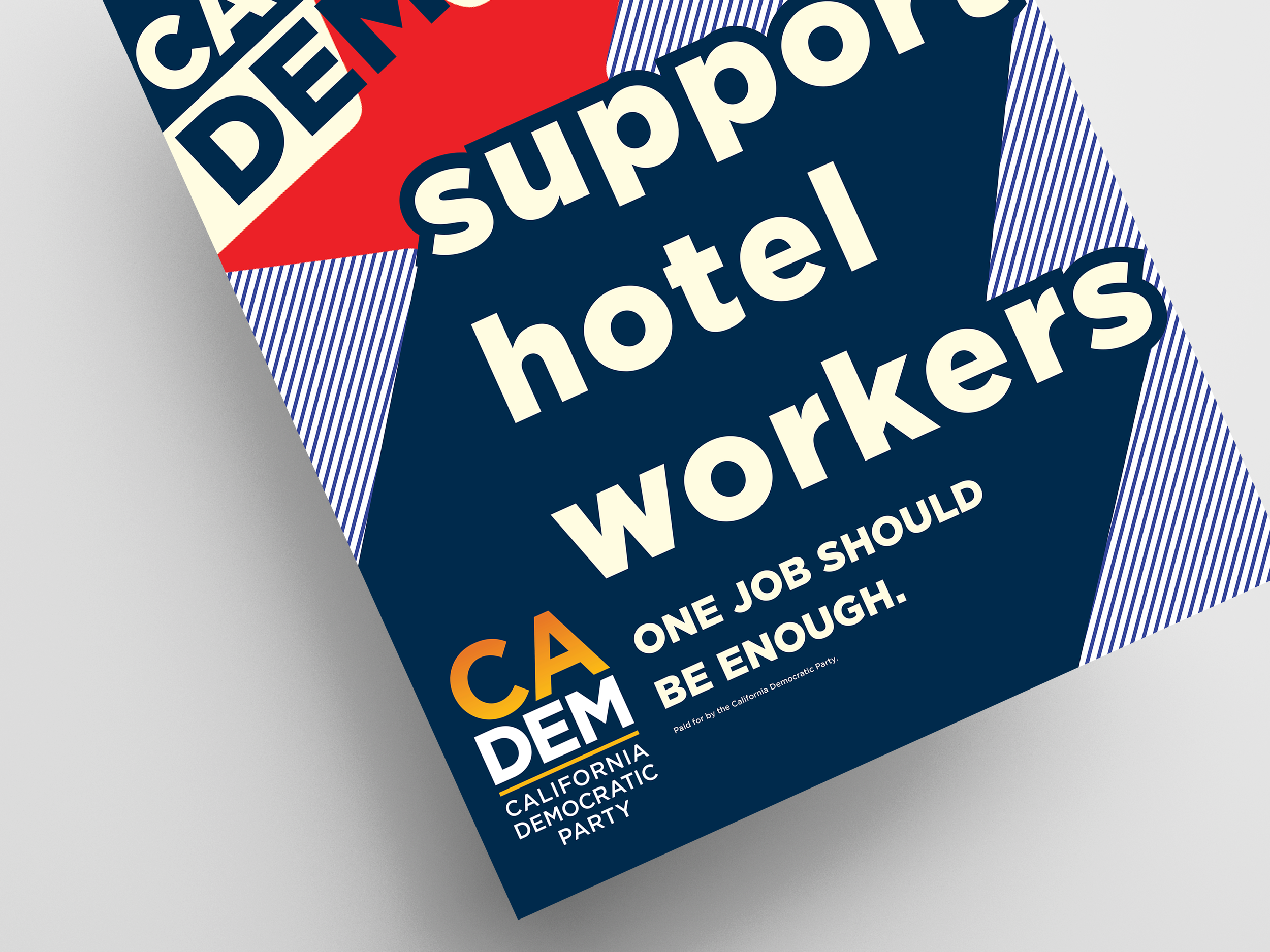
Some causes don't need convincing, they need volume, and that's exactly what this poster was built to deliver. Designed for the California Democratic Party in 2018, this piece stood behind hotel workers fighting for a simple, undeniable truth: one job should be enough. I built the design around kinetic typography and a glimmer of Russian Constructivism, creating a bold, cohesive look grounded in a striking navy and red color palette, letting the message hit with the same urgency and conviction the workers themselves brought to the picket line.
This wasn't a poster meant to blend into a rally, it was meant to be seen from across a room and felt in one glance. Every element, the angled star, the punchy diagonal banner, the stacked typographic hierarchy, was designed to command attention and turn a labor demand into a rallying cry impossible to ignore.
Elliot Earls: Visiting Designer Series
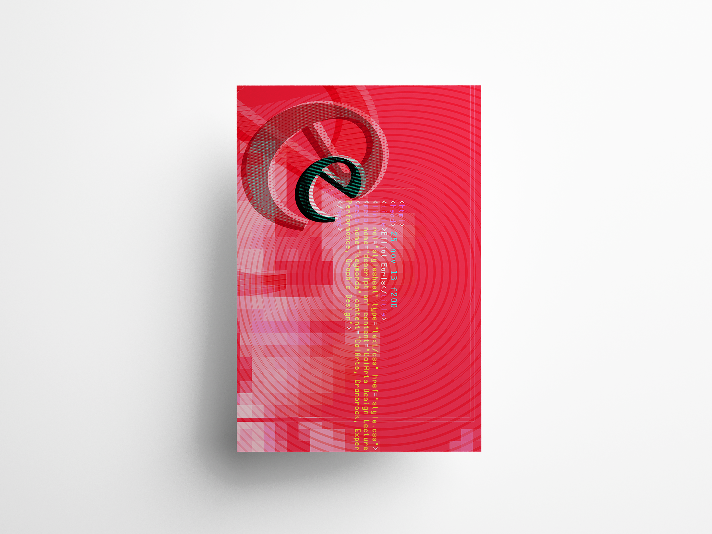
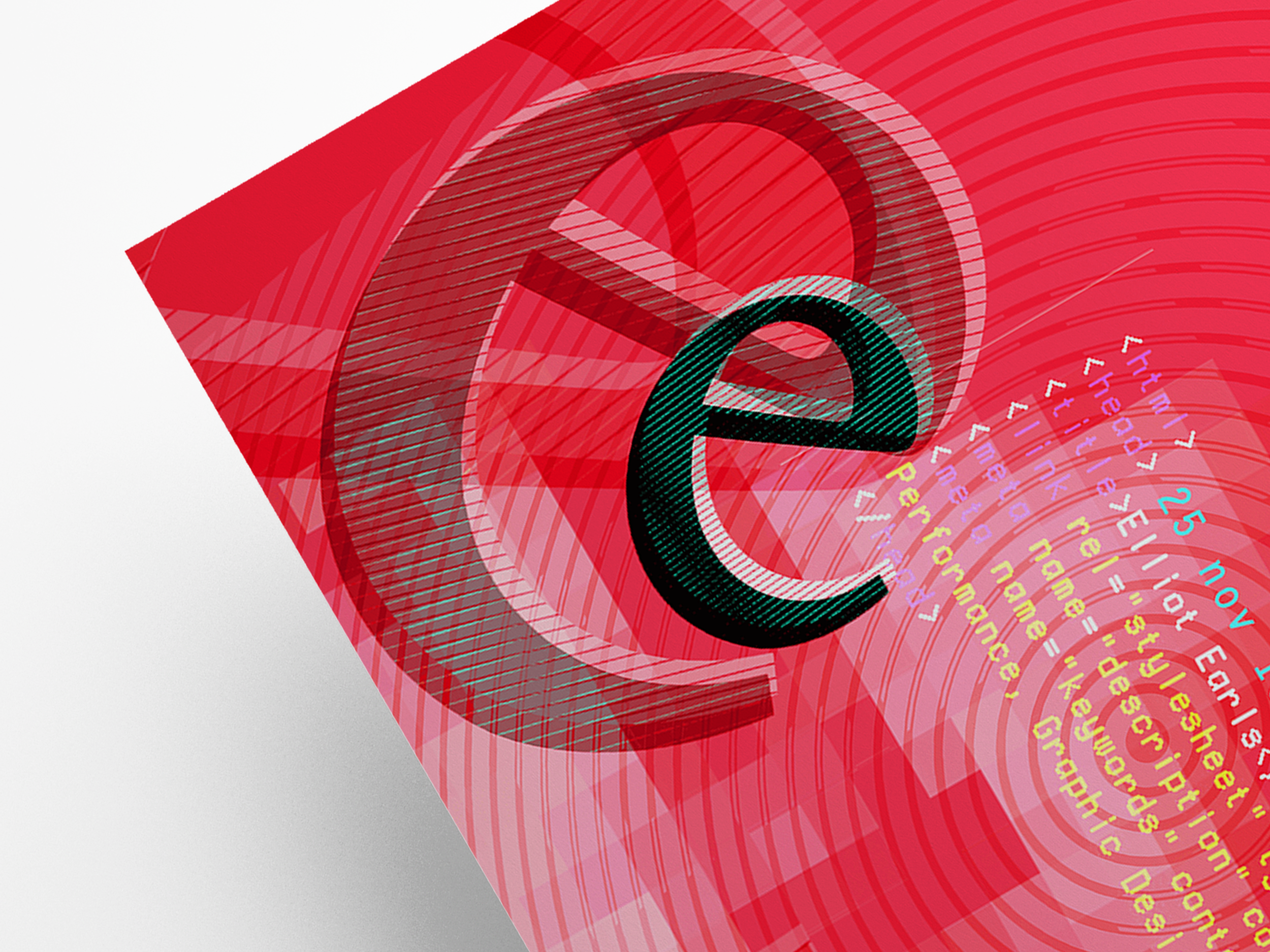
Some designers don't just break the rules, they dissolve the boundaries entirely, and that's exactly the spirit behind this exploration into the post modern design of Earls. This exhibition set out to showcase a distinct, unmistakable strain of design, one that feels less like a portfolio and more like a post modern digital acid trip.
Through the seamless integration of countless media forms, Earls achieved a level of innovation that challenges conventional design norms altogether, a creative lineage that traces directly back to the disruption pioneered at Cranbrook. This exhibition invites viewers into real dialogue, not just about Earls' work itself, but about what becomes possible when traditional boundaries are broken down entirely, opening the door to genuinely new, unexpected forms of artistic expression.
“Elliott Earls is a graphic designer, performance artist, and musician. Earls’ hybrid multimedia work blurs distinctions between high and low, performance and object, design and art. Since 2001 Earls has been Designer-In-Residence and Head of the graduate Graphic Design department at Cranbrook Academy of Art. In 2021, author Jared Fuller in an article entitled “How Cranbrook’s Design Program Redefined How We Make and Talk About Graphic Design” states “Under Earls’ leadership, the 2D Design department has blurred the lines between graphic design and art, with students working across traditional design, fine art, sculpture, and performance.” As a designer and artist, Earls's work is part of numerous public and private permanent collections including the Cooper-Hewitt National Design Museum, Smithsonian Institution, The Wolfsonian Museum, The Miami Art Museum and Cranbrook Art Museum.”
Co-designed with Jenny Song and Margaret Andersen
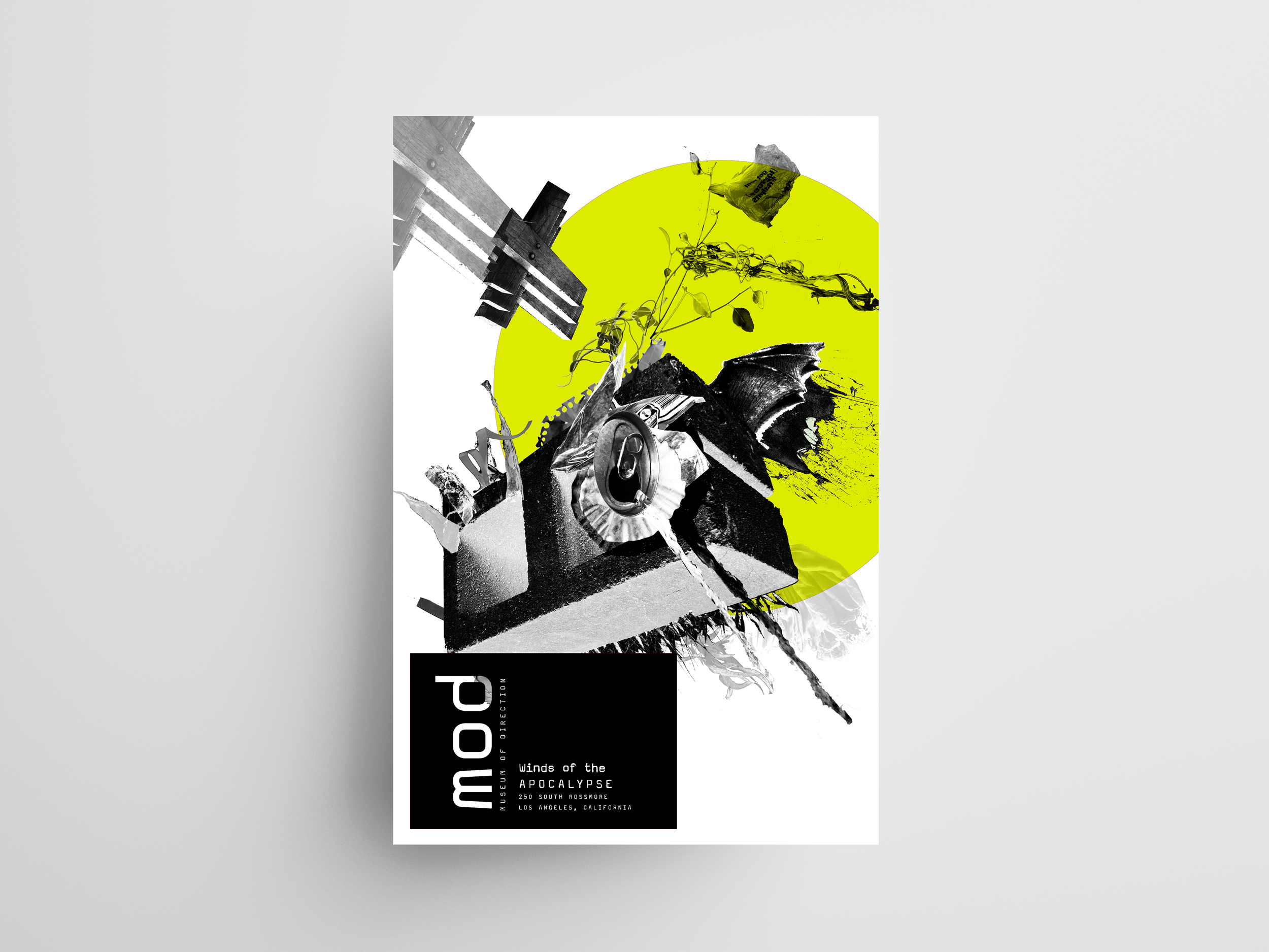
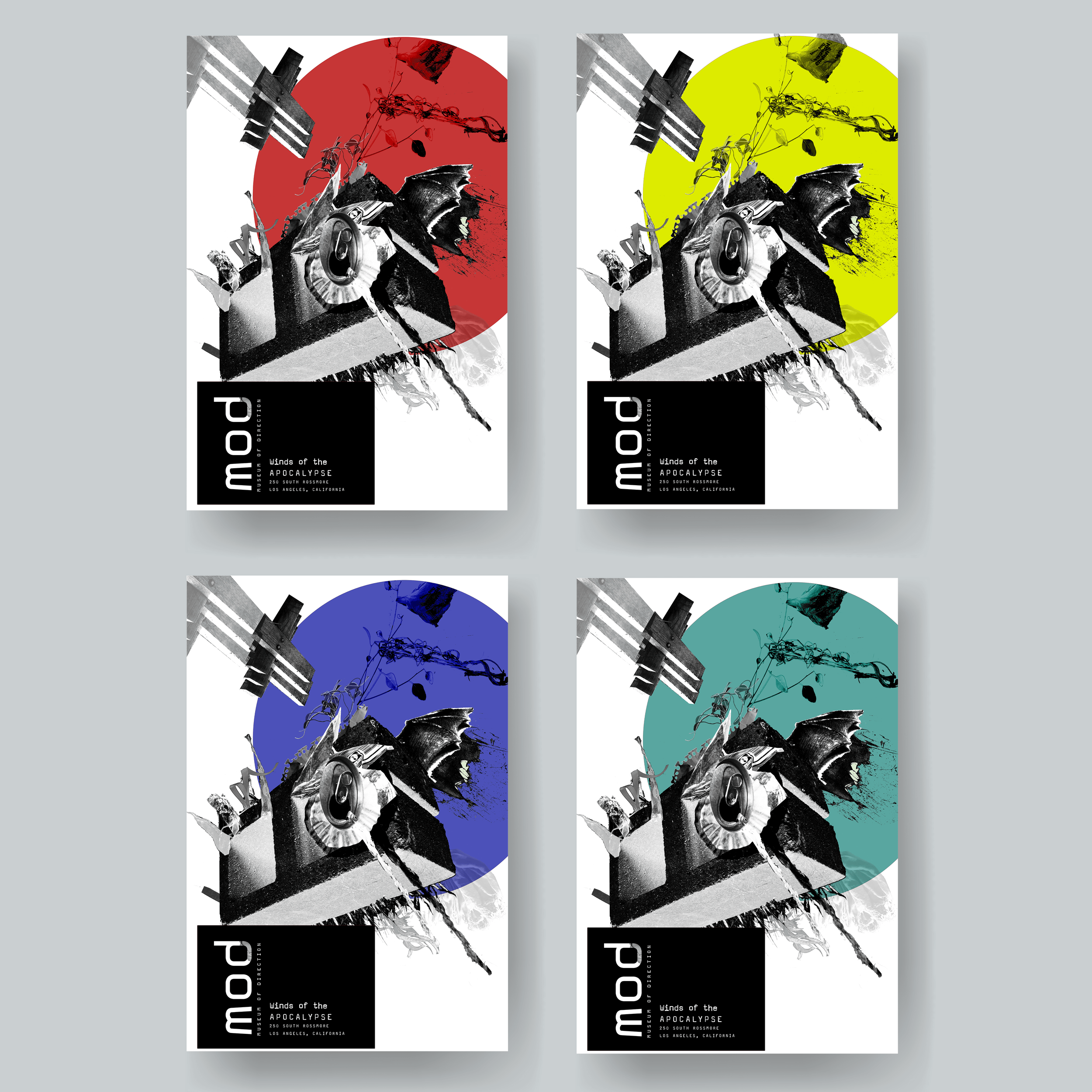
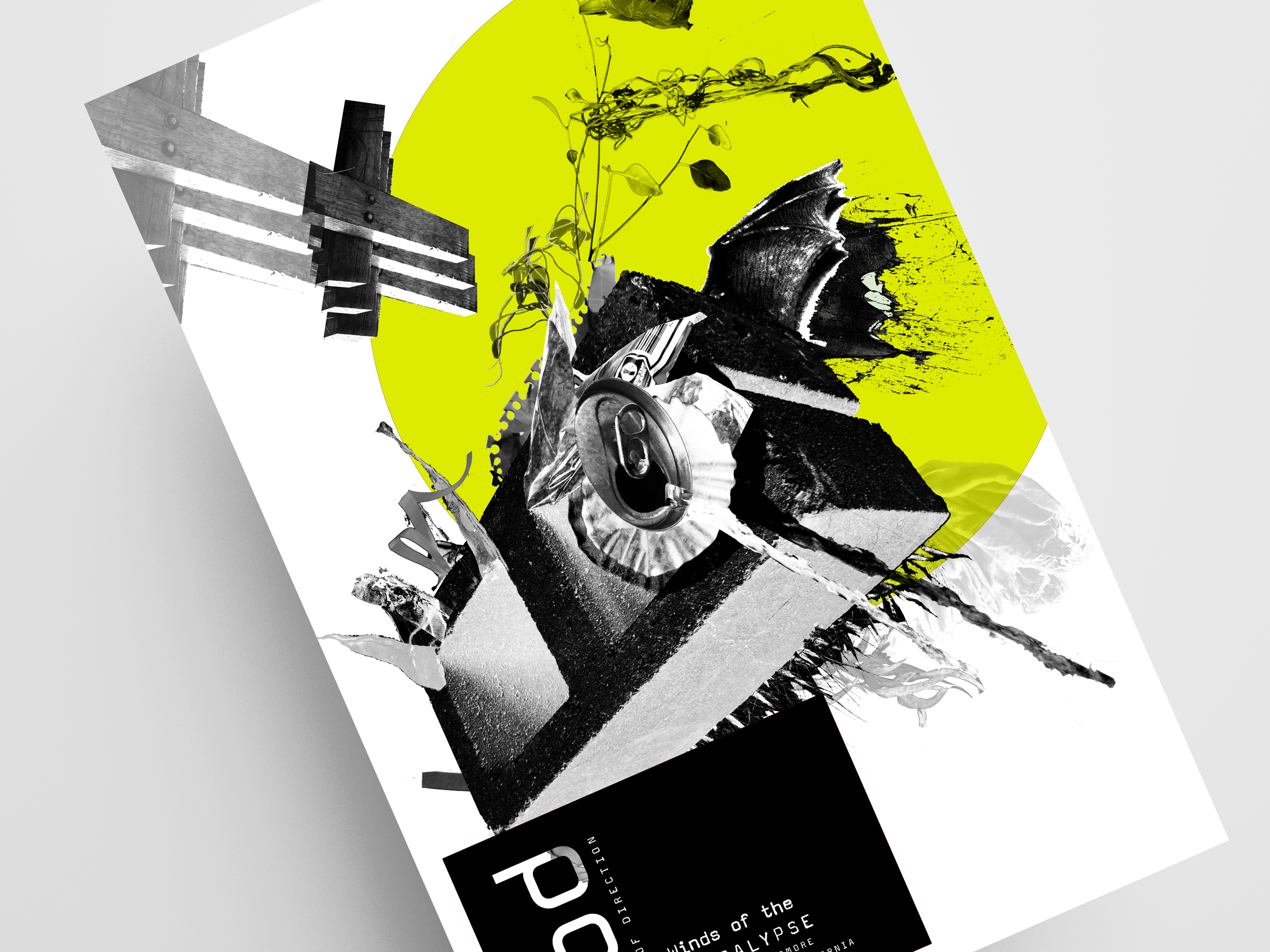
Museum of Direction: Winds of the Apocalypse
Direction, at its core, is a question of where we're headed, and that question sits at the center of "Winds of the Apocalypse," a piece exploring direction within design through photography and collage. Using fragments of images that capture movement and momentum, I wanted to interrogate our current climate crisis through the very idea of directionality itself, not where we're going, but how fast, and toward what.
This piece isn't meant to comfort, it's meant to confront. Through forced perspective, an ominous mass of trash appears to menacingly hurtle toward earth's atmosphere, set against a sickly, faded sun that feels more warning sign than celestial body. By melding disparate photographic elements into one unsettling composition, this poster lays bare the fragility of our planet, refusing to let the viewer look away comfortably.
The Connotative Poster: Frank McCourt
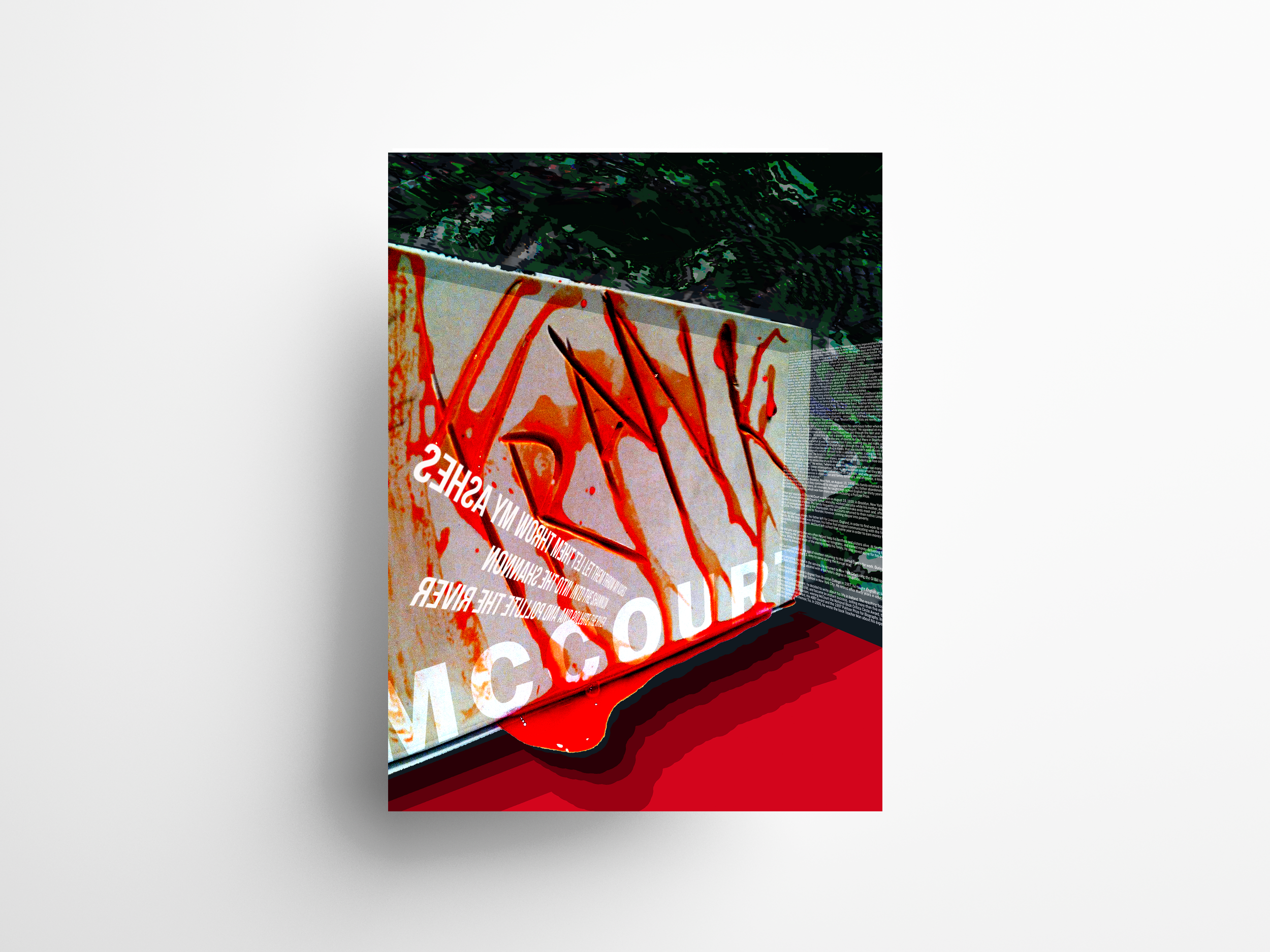
Humor and horror rarely share the same room, but in Frank McCourt's writing, they sit side by side, wit and devastation woven into the same sentence. This piece was built to explore that exact tension. McCourt's work moves fluidly between lighthearted moments and profound, unnerving truths about the human condition, and I wanted this poster to hold both at once, forcing viewers to reconsider what they assume fear and humor are supposed to look like.
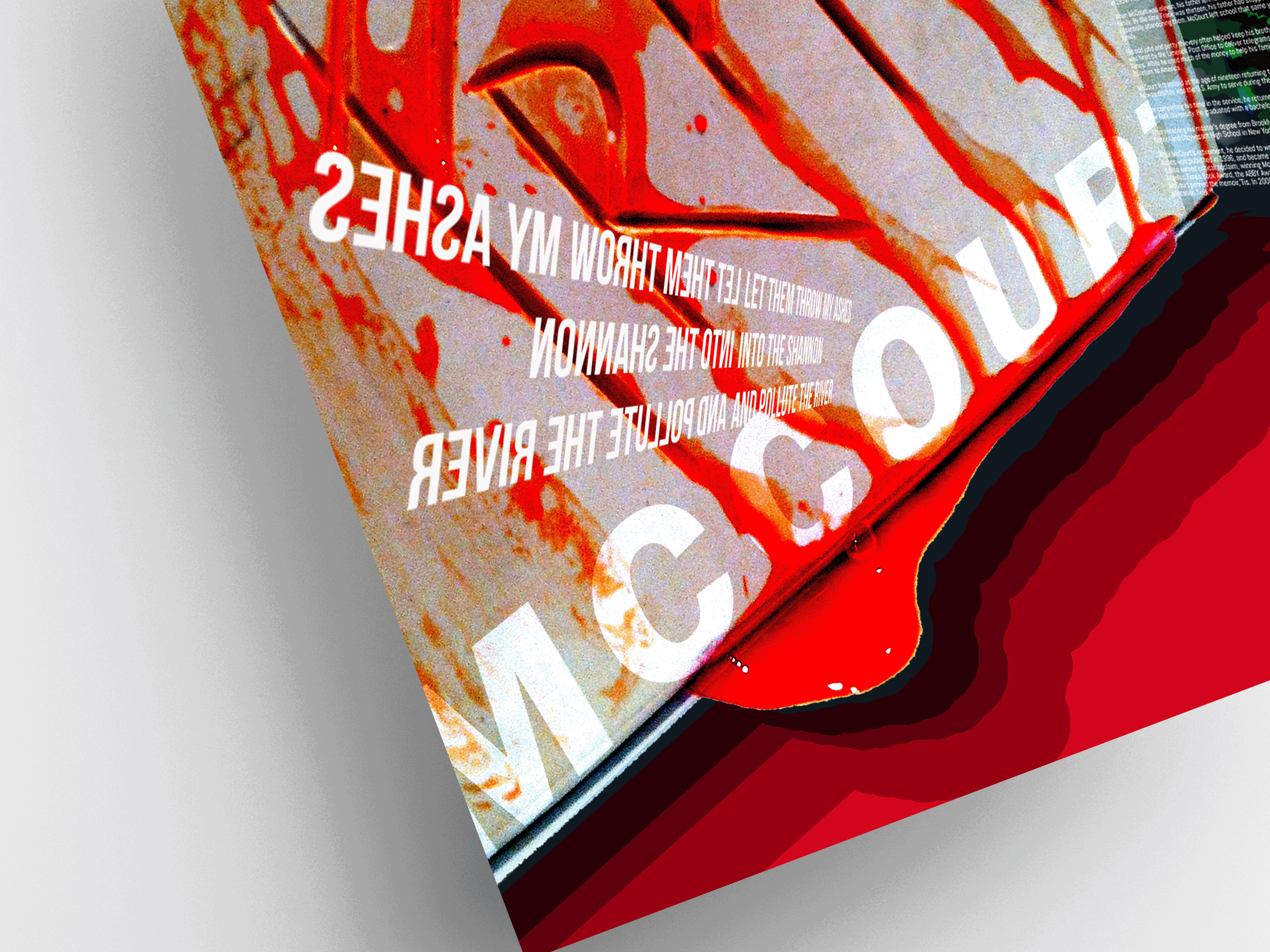
At the center of the composition sits a linoleum board, aggressively carved with McCourt's name, its rough texture heightened by red food coloring that pools at the base and drips down every groove, equal parts unsettling and darkly playful. The background pulls from crumpled, distorted pages of "Teacher Man," my favorite of McCourt's books, dyed a deep green to offset the vivid red and ground the piece in something more organic and unsettled. Together, the palette leans fully into the mood of a cheesy horror film, one that winks at you even as it unsettles you, mirroring exactly the tension McCourt built his career on.
The CalArts Writing Center
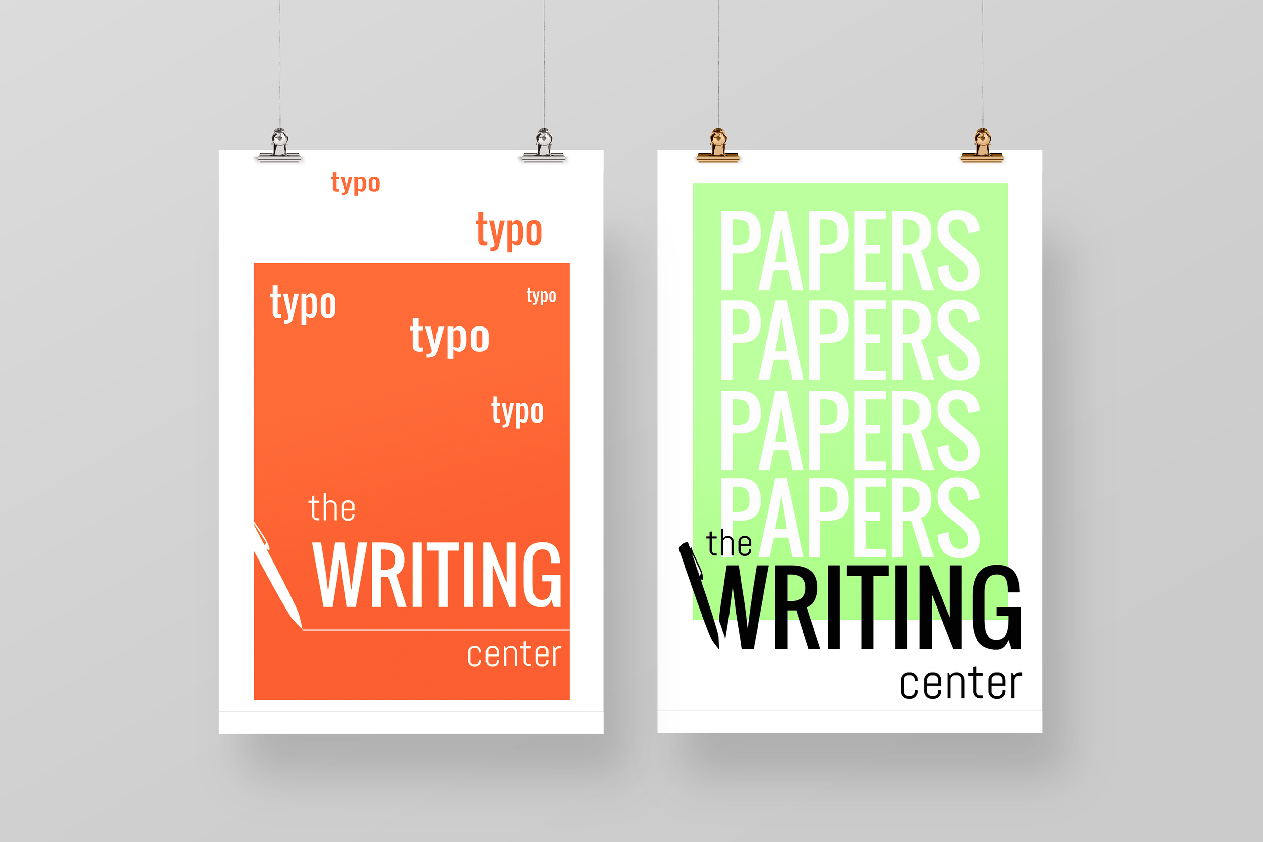
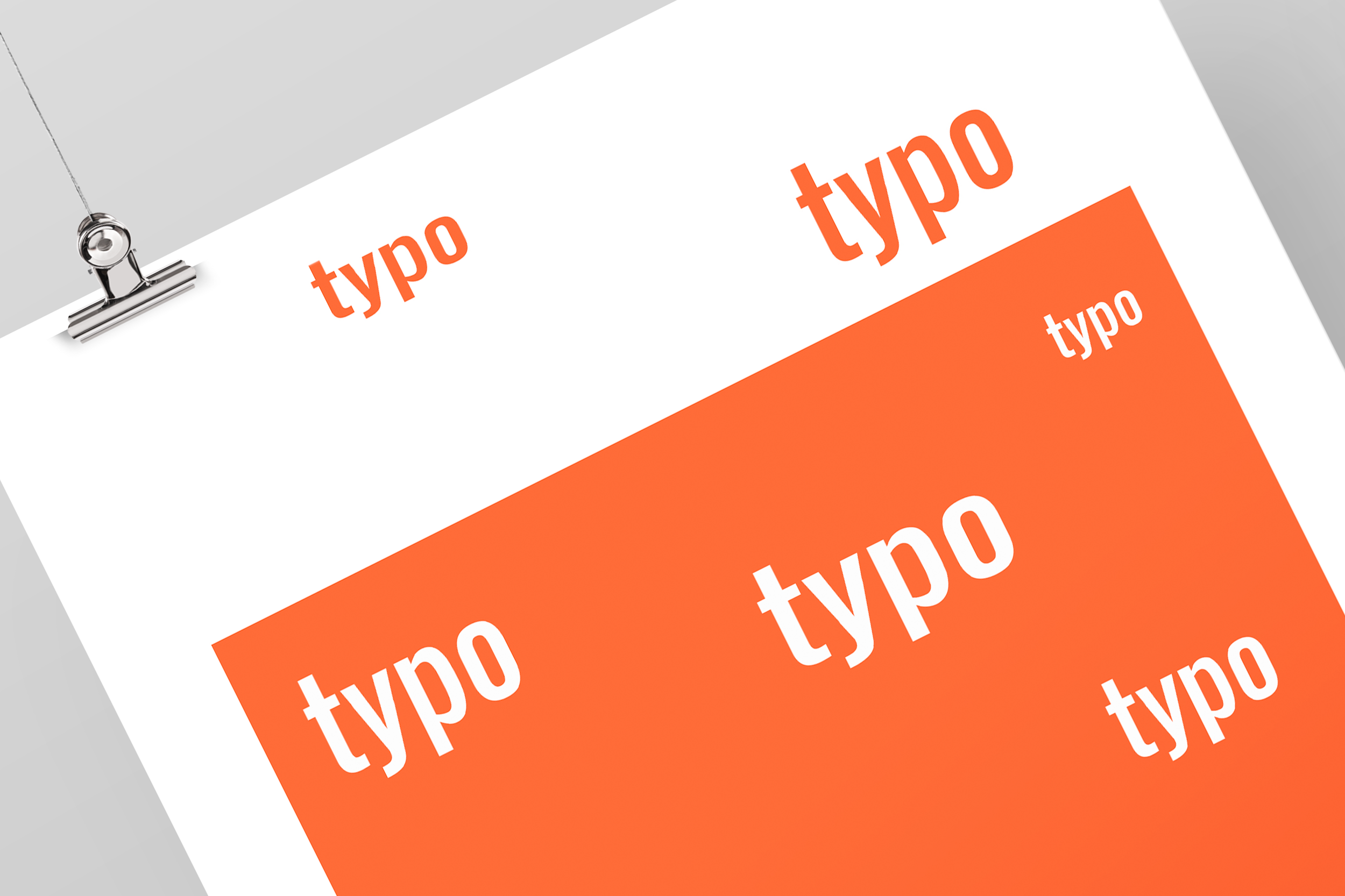
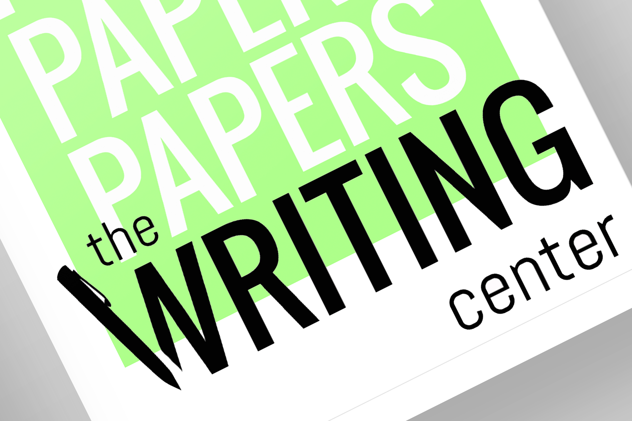
Writing anxiety is one of those struggles everyone recognizes but rarely sees represented, and that gap was exactly what these posters set out to close. Created to promote the CalArts Writing Center, a resource for students navigating exactly that kind of struggle, I wanted the design itself to feel like it understood the problem before a single word was read.
I built the series around a contrasting color palette bold enough to cut through a busy campus environment full of competing visual noise. But the real strategy lived in the typography itself, treated less like text and more like an object, twisted, strained, and visibly under pressure, mirroring the anxiety and stress so many students quietly carry through the writing process. The result is a set of posters that doesn't just advertise a resource, it reflects the exact feeling that resource exists to relieve.
Andrea Bowers: Visiting Artist Lecture Series
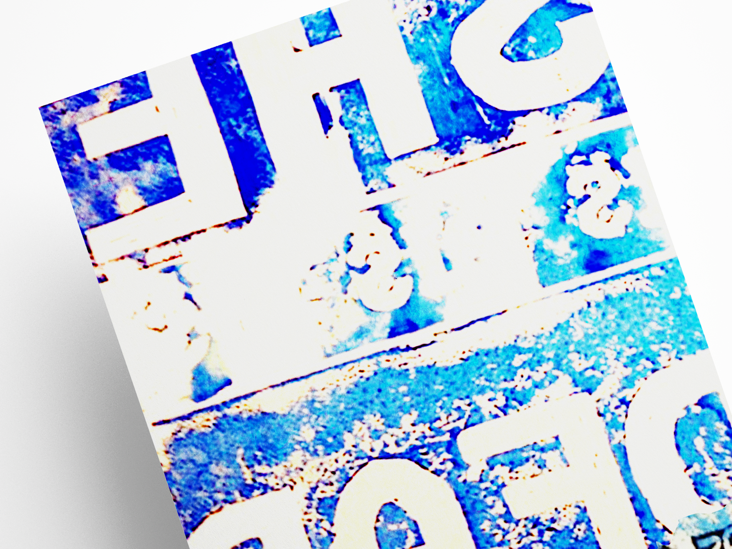
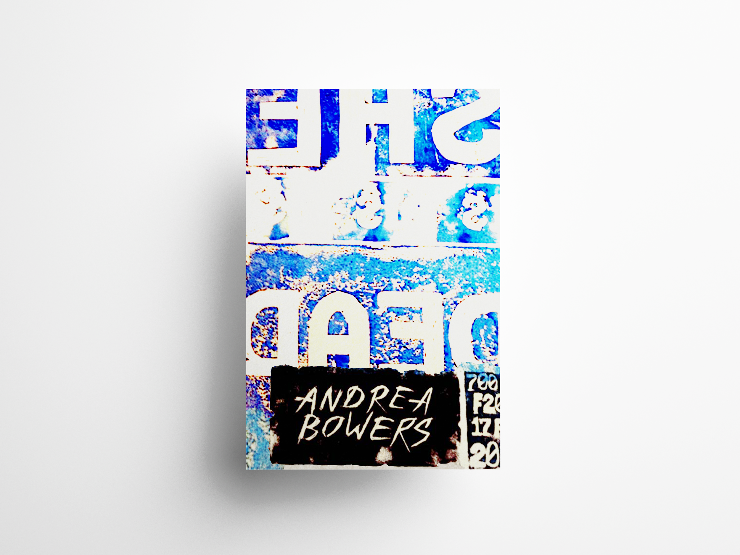
Protest art earns its power through urgency, not polish, and that instinct shaped every decision behind this piece, designed to resemble a handmade protest poster for artist Andrea Bowers. Bowers' work sits at the intersection of contemporary political issues and the long history of American protest movements, often inviting people directly affected by those issues into the gallery space itself. I wanted this poster to carry that same spirit, not observed from a distance, but made with real hands and real urgency.
Rather than screen printing the piece, I carved three massive linoleum blocks with the words "she dead," hand printing each poster with different values and layers of blue ink to create a sense of chaos, urgency, and frantic energy, deliberate even in its rawness. A fourth block, carved with the artist's name, was printed using a loosely mixed combination of burnt umber and black acrylic paint, giving the name a look that feels both deeply carved and strangely burnt, as if the mark itself had been forged under pressure rather than simply printed.